
Color? The Overlooked Personal Branding Tool That Shapes Your Reputation
Color? The Overlooked Personal Branding Tool That Shapes Your Reputation
When you think about strengthening your personal brand, color probably is not the first thing that comes to mind.
Your expertise? Absolutely.
Your reputation? Of course.
Your LinkedIn presence, website, professional headshots and the way you communicate your leadership? Probably.
But color?
Yes, color.
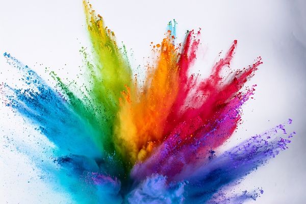
The colors associated with your personal brand can influence how people perceive your leadership before you ever say a word. That does not mean wearing blue automatically makes people trust you or adding red to your website instantly makes you appear powerful. Color psychology is more nuanced than that.
But color does communicate. And if you are intentionally building a personal brand, it deserves your attention.
Your Personal Brand Begins With Your Message
Before you start choosing colors, fonts, photography or graphics, get clear about your message.
What do you do?
Who do you help?
Why does your work matter?
What transformation does your leadership or expertise make possible?
Where are you headed, and why should people want to support that vision?
Your visual identity should reinforce those answers.
Think of it as the show in show-and-tell. Your message tells people who you are and what you represent. Your visual identity helps them see it.
That is why choosing a color simply because you like it is not much of a personal branding strategy.
The better question is:
What do I want people to understand and feel when they encounter my personal brand, and does my visual identity reinforce it?
I Learned the Power of Color in PR
Years ago, I led the PR team that helped launch Minute Maid’s Simply Orange.
Our assignment was to generate publicity that would help drive retailer buy-in in several key markets as the company considered a national rollout.
There was just one problem.
There was nothing particularly newsworthy about an orange juice company introducing...orange juice.
We needed a story.
Simply Orange came in a distinctive clear carafe that put its bright orange color front and center on store shelves. So instead of simply pitching another orange juice, we built a campaign around the color orange.
Orange is commonly associated with qualities such as energy, vitality, warmth and optimism. That gave us something much more interesting to talk about.
Morning news anchors talked about it. Radio hosts talked about it. Newspapers talked about it. Product sampling and events supported the campaign, but everything was connected by one simple idea: bringing more orange to the city.
The campaign generated publicity, helped support retailer buy-in in those markets, and Simply Orange ultimately became a national brand.
That experience reinforced something I want leaders to understand about their own brands:
Color is not merely decoration. Color communicates.
What Are Your Colors Communicating?
Research into color psychology has associated different colors with certain perceptions and emotional responses. Context, culture, personal experience and even the particular shade matter, so there is no universal formula.
Still, understanding some common associations can help you make more intentional choices.
Blue is frequently associated with trust, stability, competence and dependability. Deep navy can create a very different impression from a soft powder blue, but there is a reason blue appears so frequently in corporate, financial, healthcare and political environments.
Red gets attention. It can communicate energy, strength, urgency and power. For a personal brand, that may mean red works better as an intentional accent than as the dominant color.
Green is commonly associated with growth, nature, balance and renewal. Deeper greens can feel established and sophisticated, while lighter greens can create a fresher, calmer impression.
Orange and yellow tend to bring energy, warmth and optimism. They can also attract attention quickly, which makes thoughtful use particularly important.
Purple has long carried associations with royalty, luxury, wisdom and distinction. Richer purples can contribute to a sophisticated presence, while brighter shades may feel more creative and expressive.
And black and white remain a powerful combination for a reason. Black can convey strength, sophistication and formality, while white creates simplicity, space and clarity.
None of this means you should immediately change your personal brand to navy blue because you want to appear trustworthy.
It means you should become more intentional about what your visual choices are communicating.
Does Your Personal Brand Look as Credible as You Are?
This is where color becomes bigger than color.
You may already have years of experience, significant expertise and a strong track record. But when someone encounters you online for the first time, they do not have access to everything you know about yourself.
They have what you give them.
Your website.
Your LinkedIn profile.
Your headshots.
Your social media presence.
Your presentations.
Your content.
And all of those things create signals about who you are.
Your visual identity should not make people work to reconcile what they see with the caliber of leader standing in front of them.
Your message and your visual presence should work together.
Take a Fresh Look at Your Visual Identity
Pull up your website and LinkedIn profile. Look at your most recent headshots, social media graphics and presentation deck.
Then stop asking only:
Does this look good?
Instead, ask:
What is this communicating about me?
Does your visual identity reflect the leader you are today?
Does it reinforce what you want to be known for?
Is there consistency from one platform to another?
Does it support the reputation you have worked hard to build?
And perhaps the most important question:
Does your personal brand reflect where you are going, or is it still representing an earlier version of you?
Your personal brand will not replace excellent leadership, meaningful work or a strong reputation.
But it can help ensure that your experience, expertise and credibility are being communicated clearly and consistently to the people whose support you need to move your vision forward.
And yes, even something as seemingly simple as color can play a role.
Listen to Episode 15
In Episode 15 of Ambitious Leadership for Christians with Nicole Pride, “Color? The Overlooked Personal Branding Tool That Shapes Your Reputation,” I go deeper into how color can influence your visual identity and the way others experience your personal brand.
And if you want to go beyond the podcast, become an Ambitious Leadership Insider. You will receive additional insights, resources and opportunities to help you strengthen your leadership, build your personal brand and move your God-given vision forward.
Join the community at nicolepride.com/insider.